The Client
LiCONiC, a company from Liechtenstein, is well-known for making super high-tech fridges and incubators. These machines store everything from chemical samples to biological materials, some in extreme conditions like -196°C. Their products range in size and are crucial for various industries, including research and biotech. Despite being leaders in their field, their branding and online presence had a dated, '90s feel, which wasn’t doing justice to their cutting-edge innovations.
The Challenges
LiCONiC initially reached out with a simple request—make a video for their website. But after a bit of conversation, we realized their whole website needed a revamp. Their product portfolio was messy, the structure was confusing, and overall, the look just didn’t reflect the tech-savvy image they wanted to project.
The company hadn't worked with professional designers before, so they were pretty attached to their old-school style. The gap between their outdated brand and what’s trendy now was huge, and updating things felt like a big leap for them.
My Approach
We started by organizing their product portfolio, simplifying everything, and creating a user-friendly website. I designed a sleek new look for their brand, proposed new logos for their products, and reworked their copy to better showcase their tech.
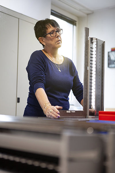
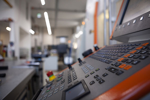
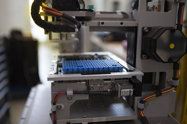
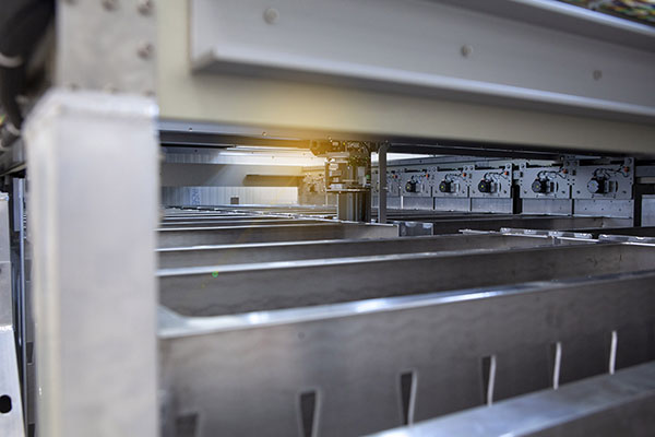
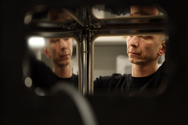
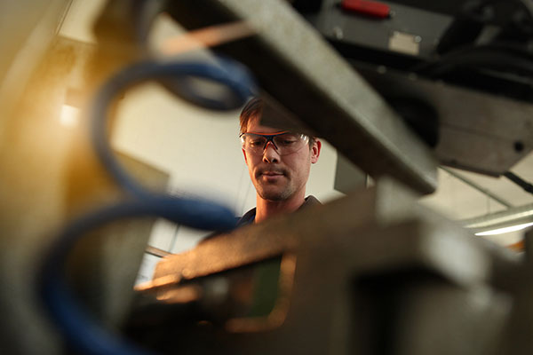
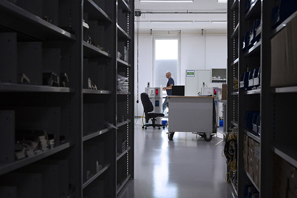
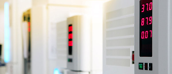
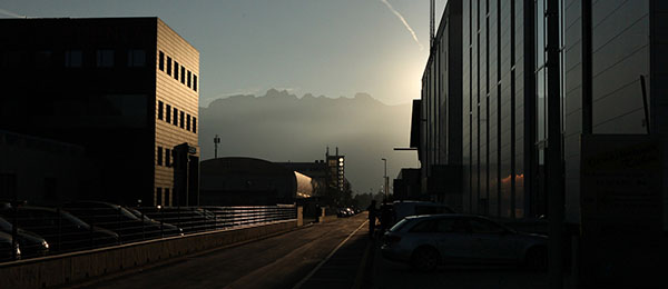
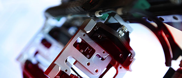
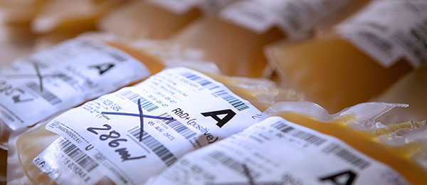
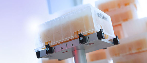
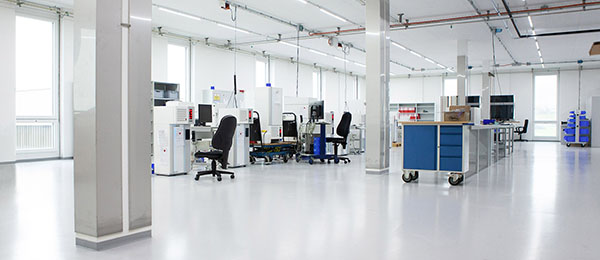
Along the way, I even shot fresh photos for the site, since they didn’t have the right visual materials to work with. The whole team—from the CEO to their sales managers—was thrilled with how the brand and website were shaping up.
The Setbacks
Unfortunately, as the project progressed, the owner decided to hold on to some of the old elements, like the outdated logos and confusing product names. This led to a mashup of the old and new, which wasn’t the clean, cohesive look we were aiming for. It became clear that the full potential of the rebrand couldn’t be realized, and the project no longer aligned with my creative vision.
Outcome
We did manage to launch a responsive website that modernized their presence, though it still had some inconsistencies. After delivering the site, I chose to step back from the project, as it no longer represented the professional standard I aim for in my work. While the final product wasn’t everything we envisioned, it was a solid step forward for LiCONiC, helping them maintain their position in the automated incubator market.
This experience highlighted the importance of balancing old brand values with modern design to stay competitive in a fast-evolving industry.
My version of the homepage »
Liconic's official version »
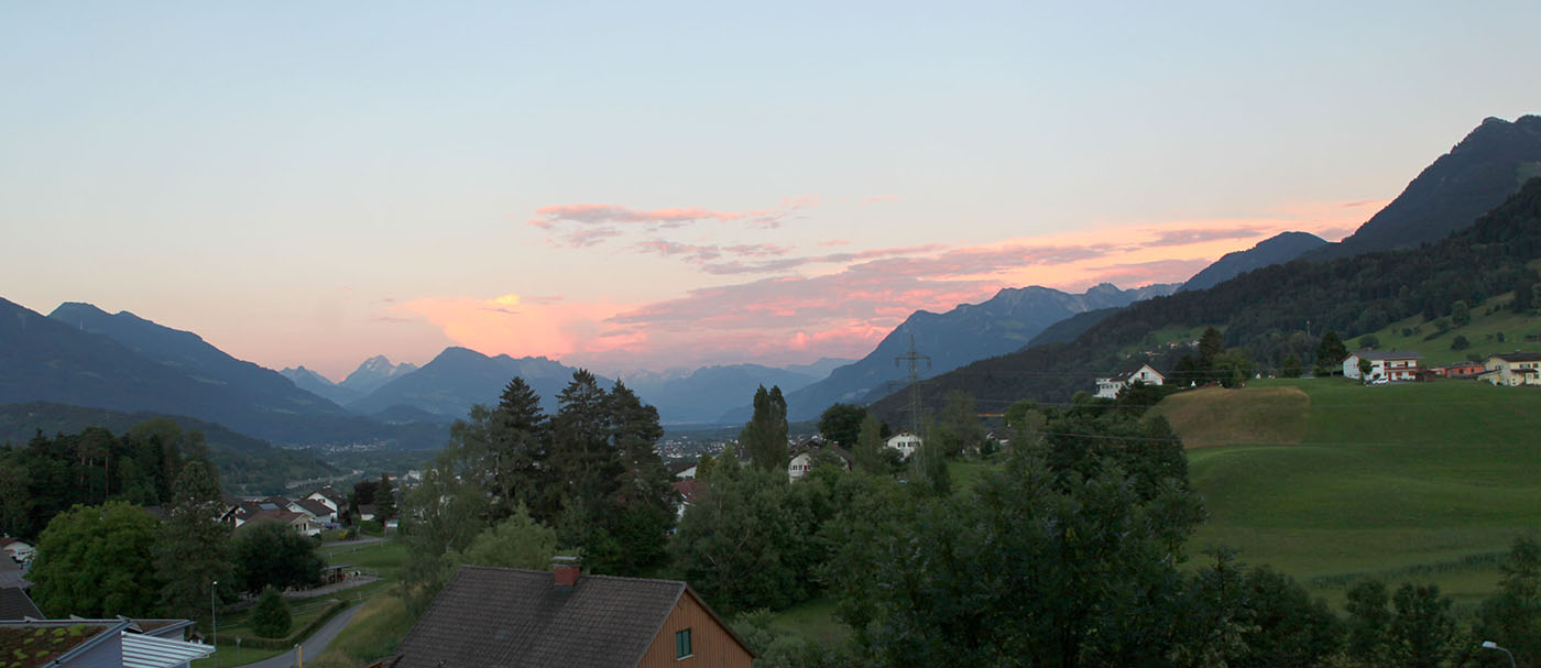
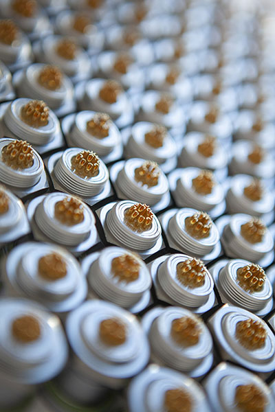
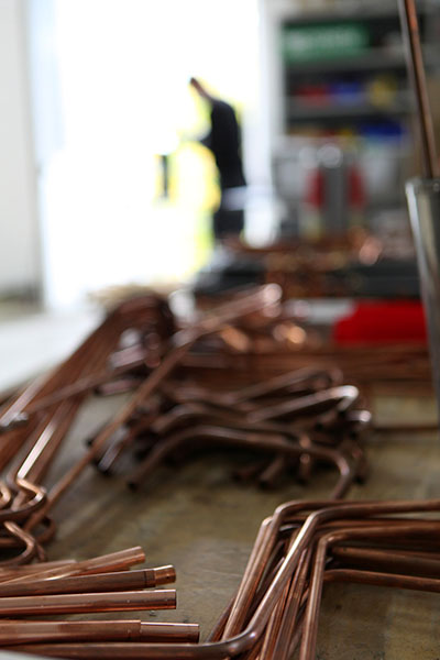
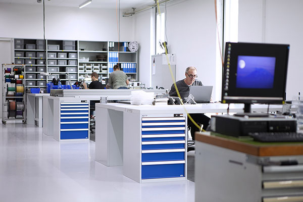
Some of the photos I shot at HQ for the Liconic homepage Tour:

Parts of the Brandbook for Liconic:
The webpage footer:

Early WIP of the Liconic product hierarchy:

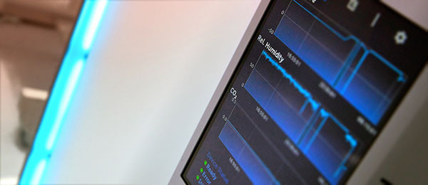
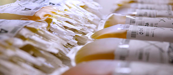
Some more photos I shot for their homepage: